Manny's Performance Space Logo design

My friend Corey of Gorinto Productions was visiting NY and while having diner he told my about his new project Manny's, a new performance space in Central PA.
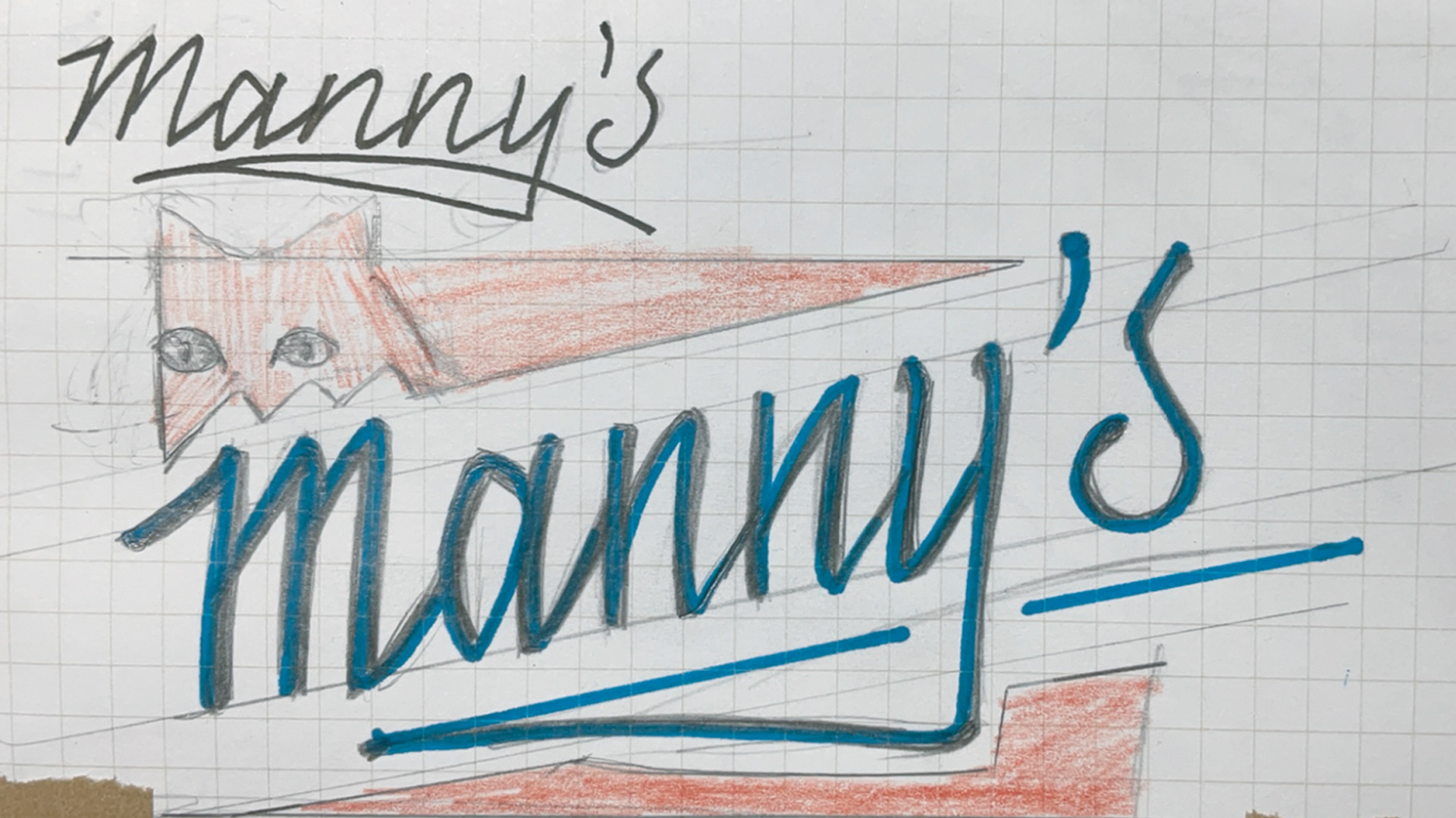
He had this refence for the look he was going for and asked me if I could create something in that style.
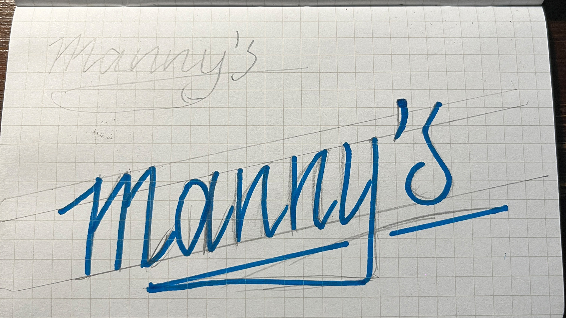
I started by laying down some solid bones for the letters. I wanted the script to have limited variation in weight.
I kept working on it, giving additional passes with my pencil. This helps when digitizing and understanding how I want each letter to feel.
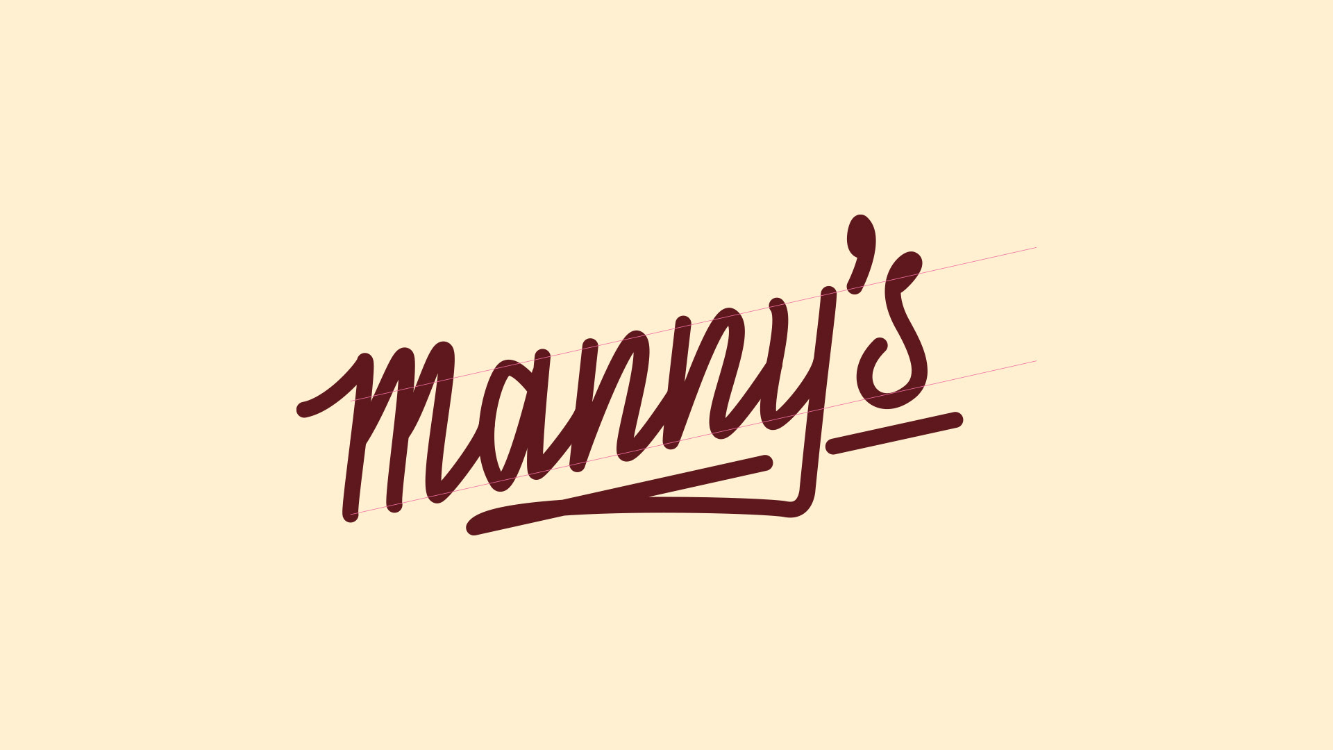
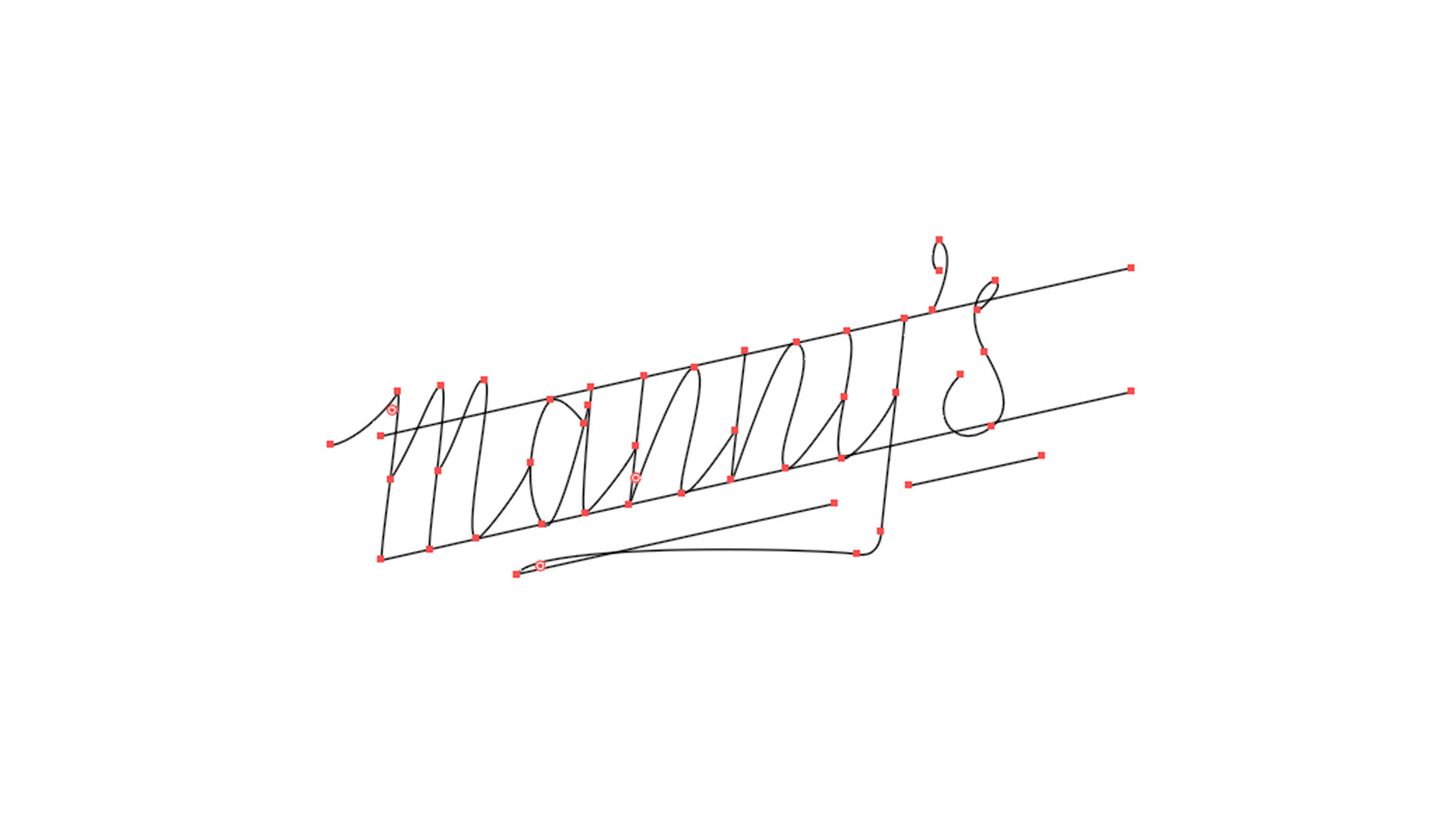
Once on the computer, I try to keep my anchor point to a minimum.
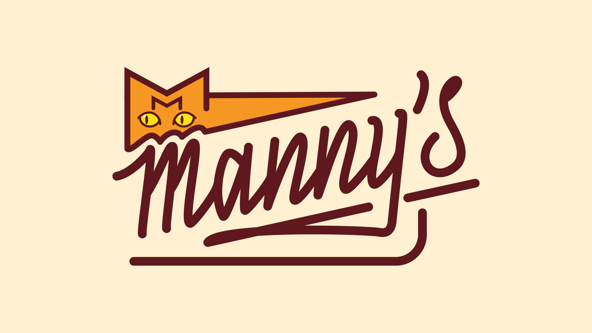
Here you can see the logo with the same weight.
Using the width tool I adjust each stroke for a nice balance.
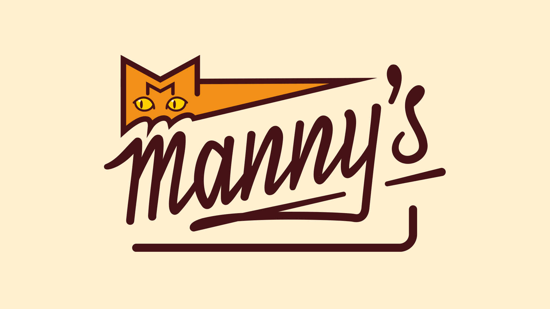
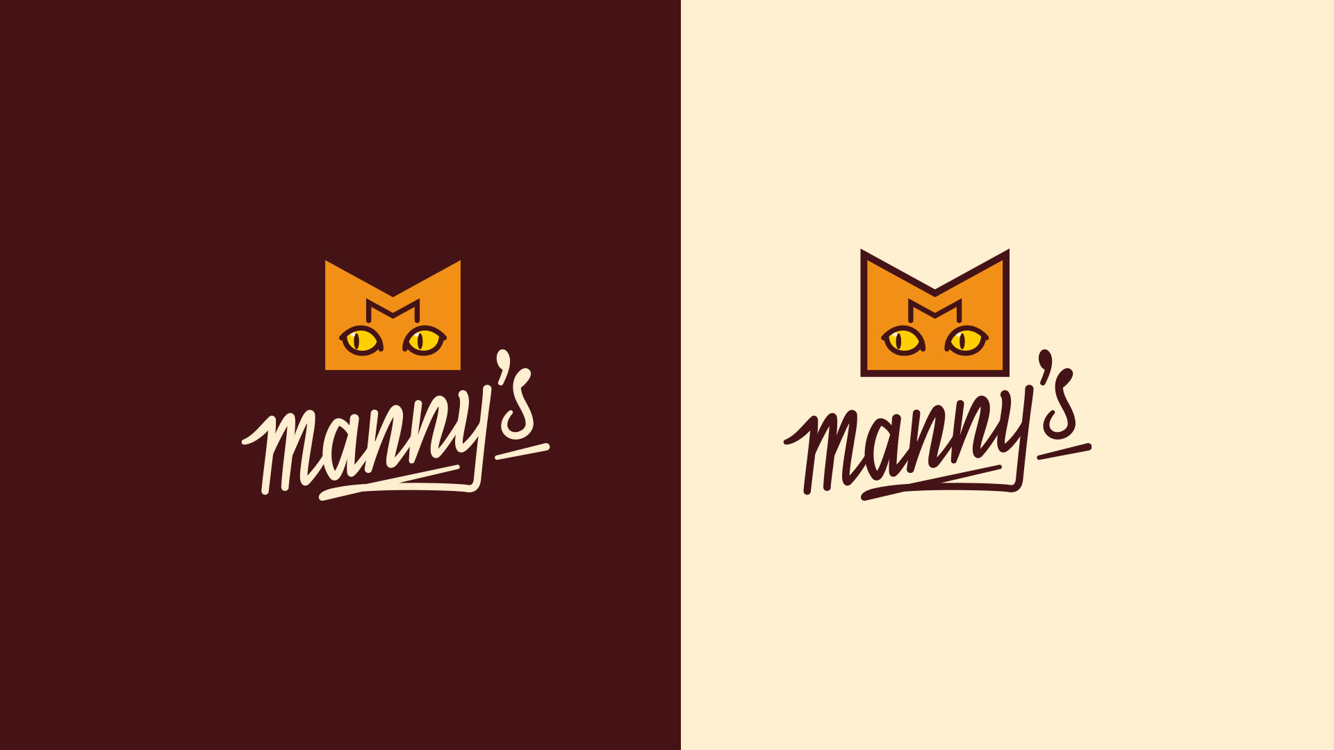
Here you can see variations on how the logo can appear.
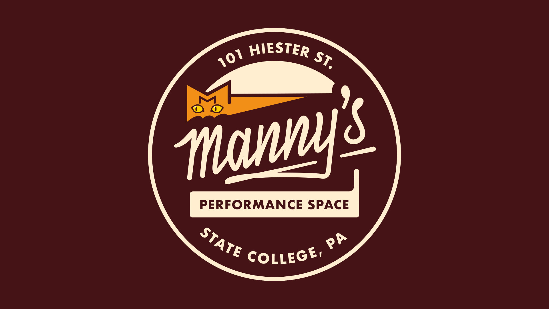
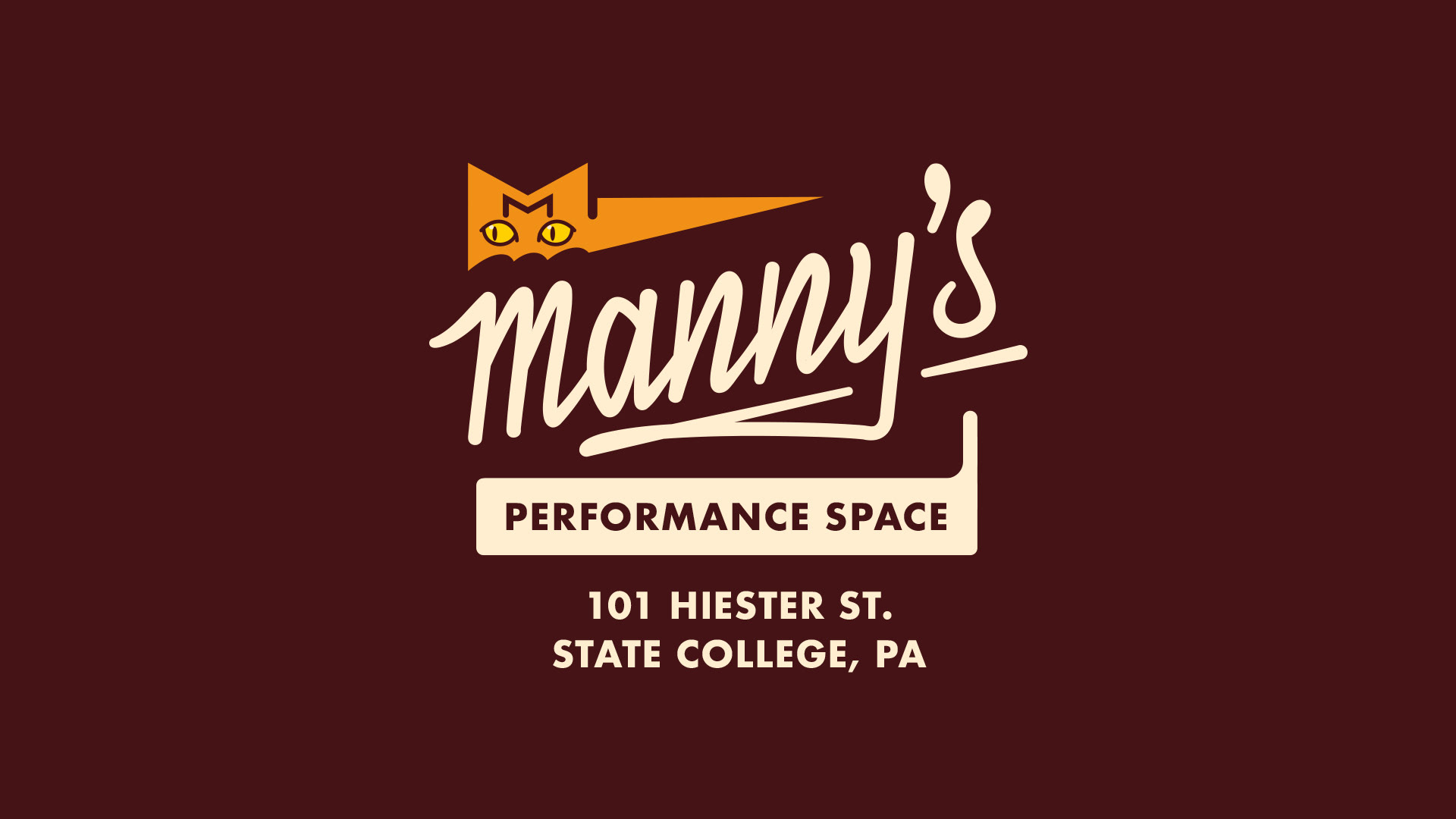
I created a night and day version of the logo, one for dark backgrounds the other for light.
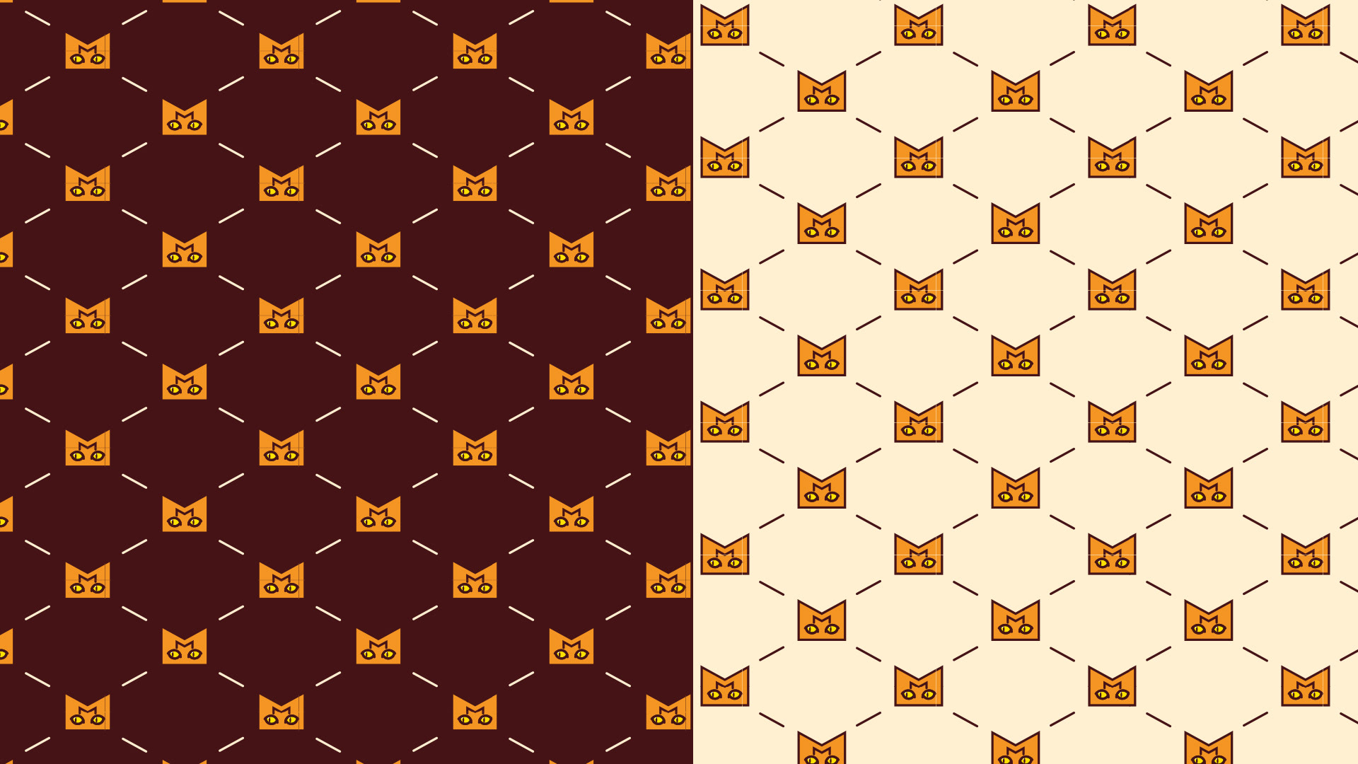
An additional pattern using the Manny's icon
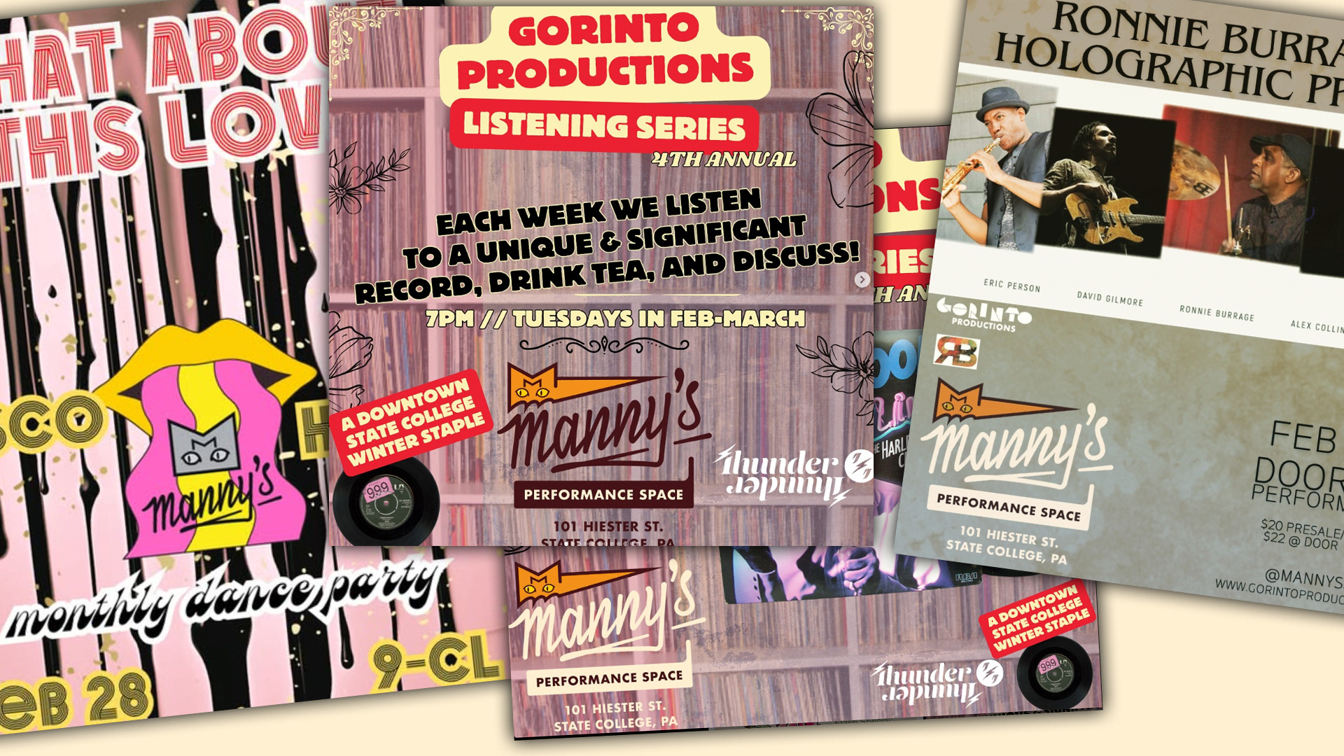
The logo hard at work on all Gorinto Productions events.
R.I.P. Manny